n
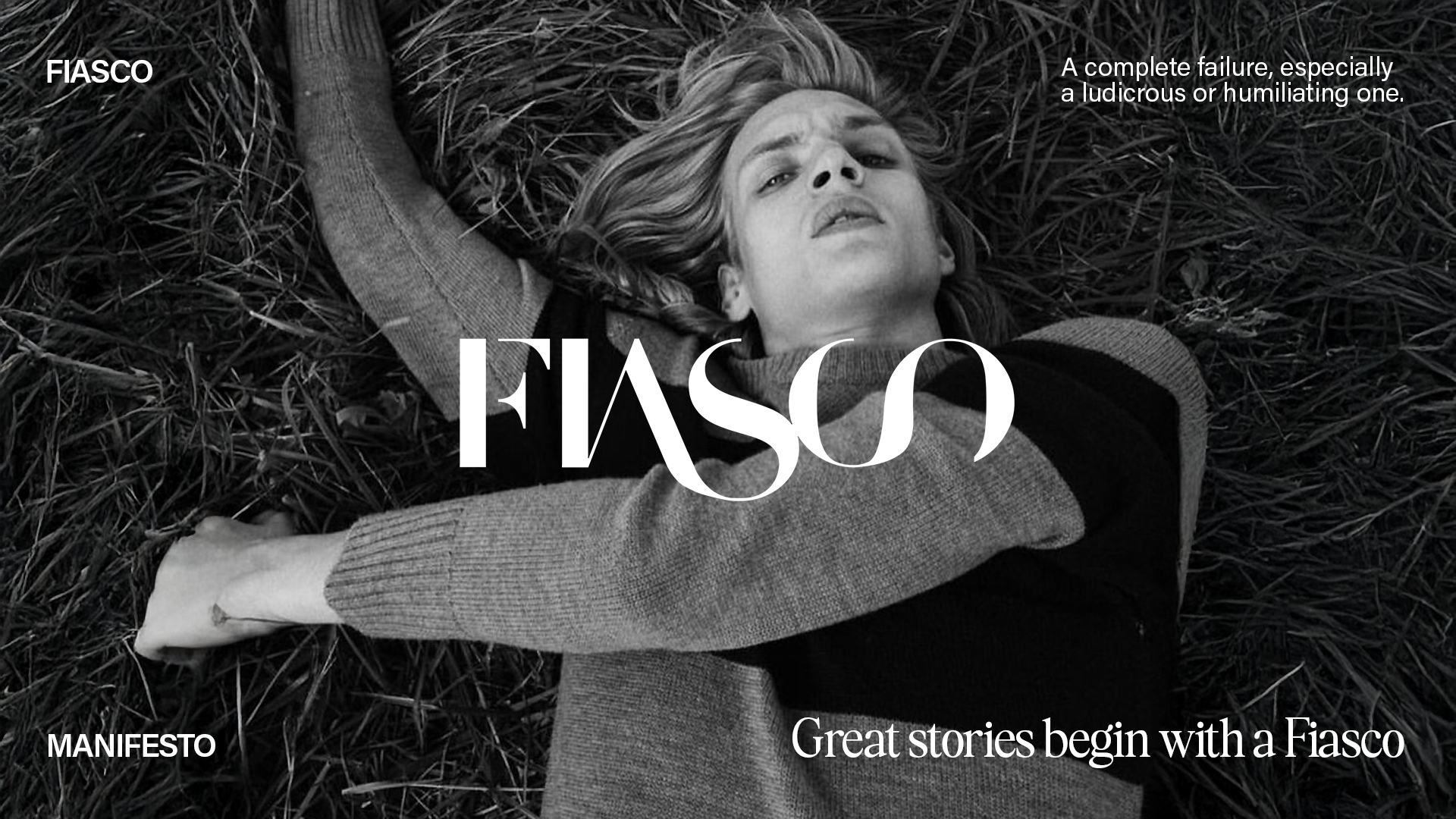
Fiasco Magazine wanted to create a new and consistent brand identity. They had been a niche, online-only fashion magazine, but they wanted to transition to a widely circulated publication covering up-and-coming fashion, design and youth culture.
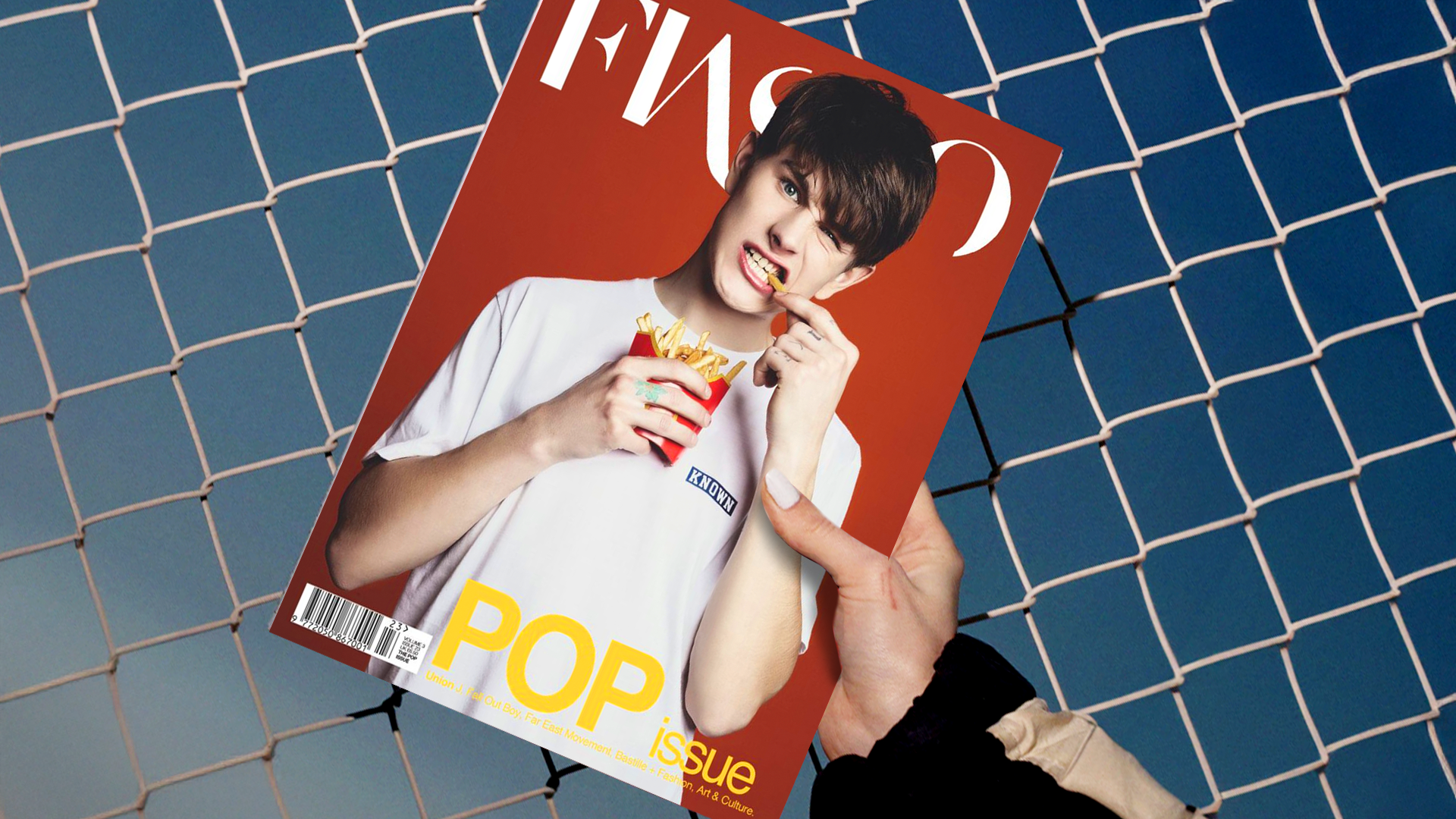
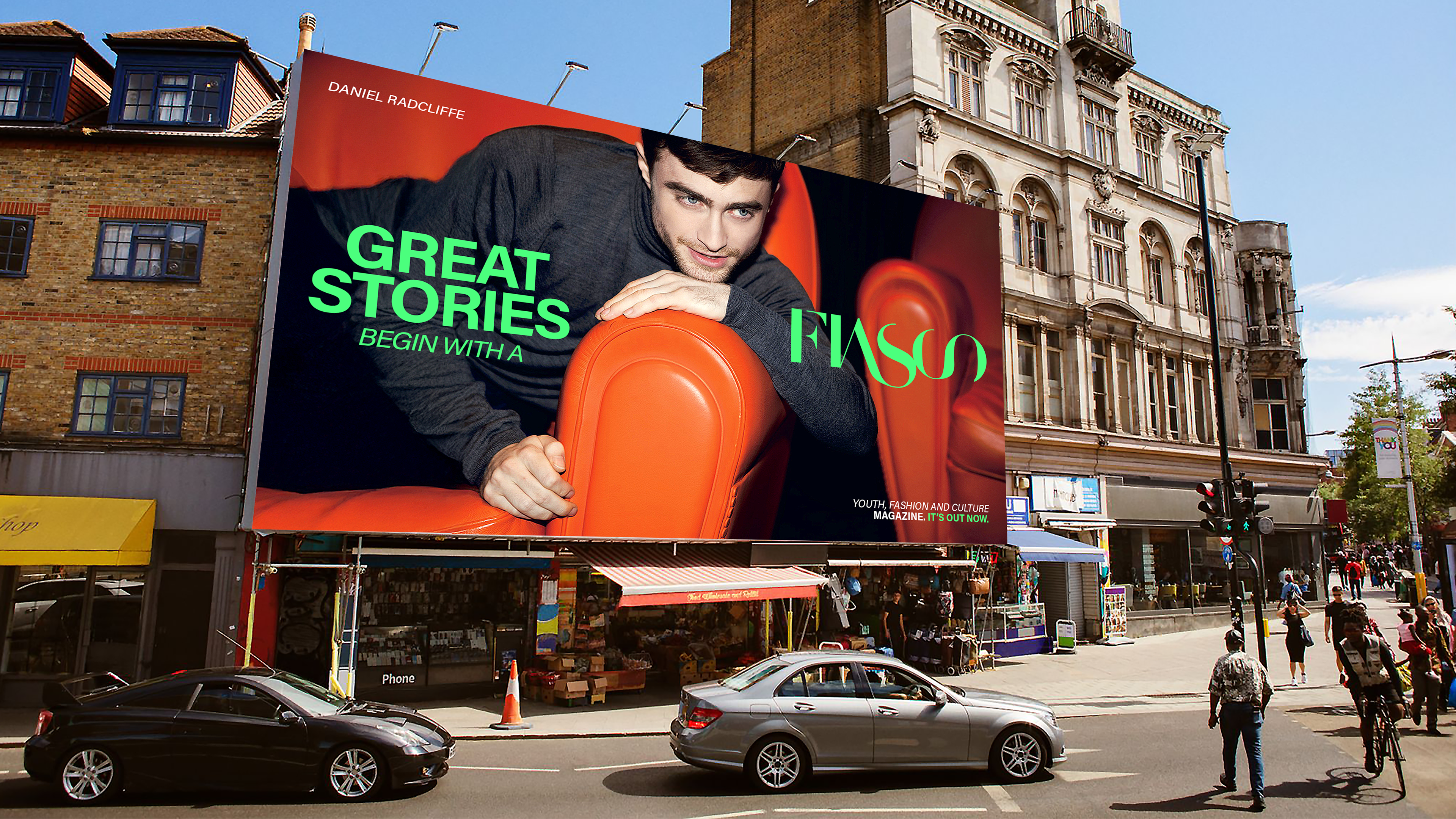
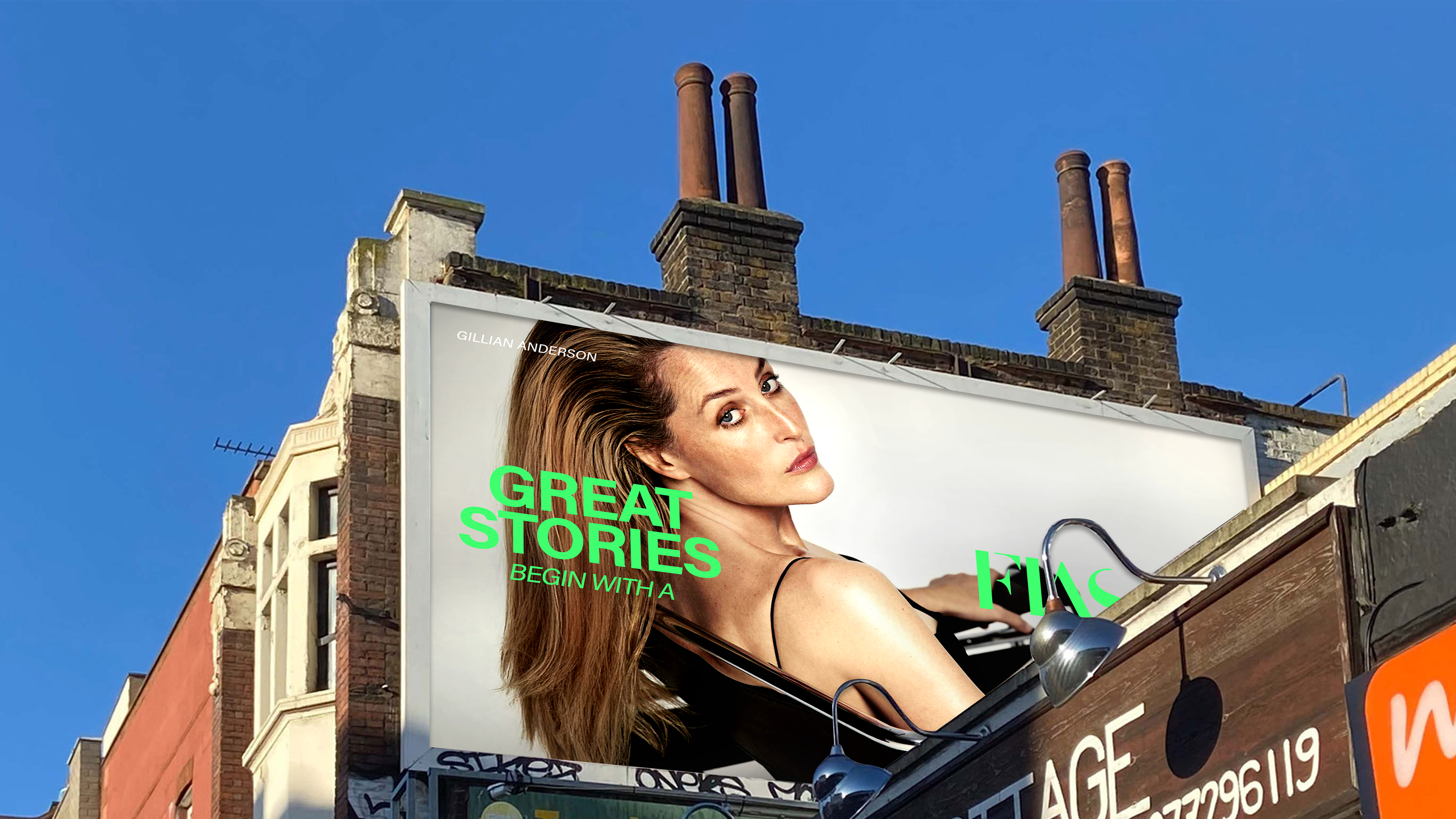
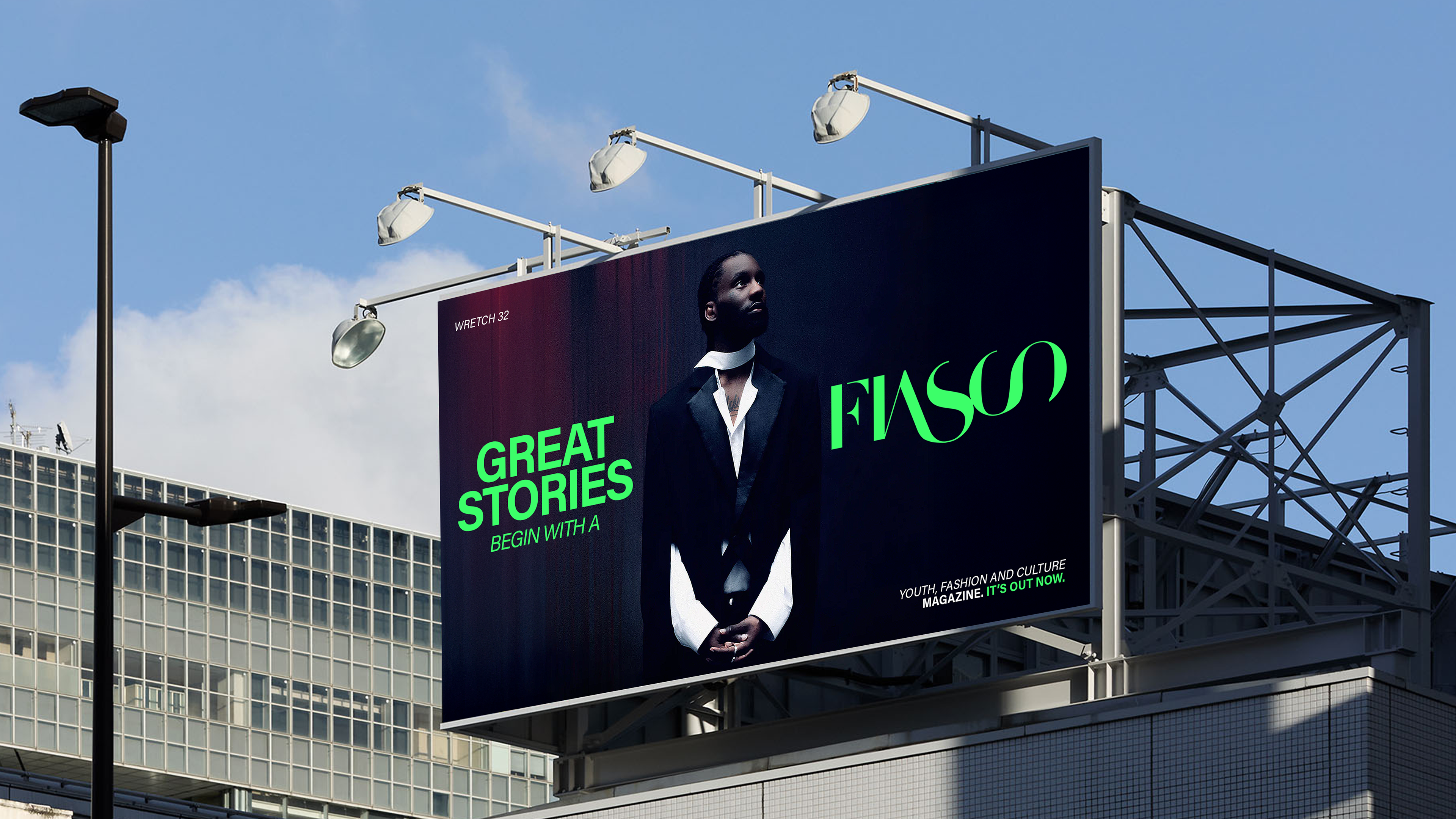
Inspired by their name, FIASCO, we made a creative concept about redefining the meaning of the word FIASCO, moving from a ludicrous, humiliating failure to a mandatory step to greatness.
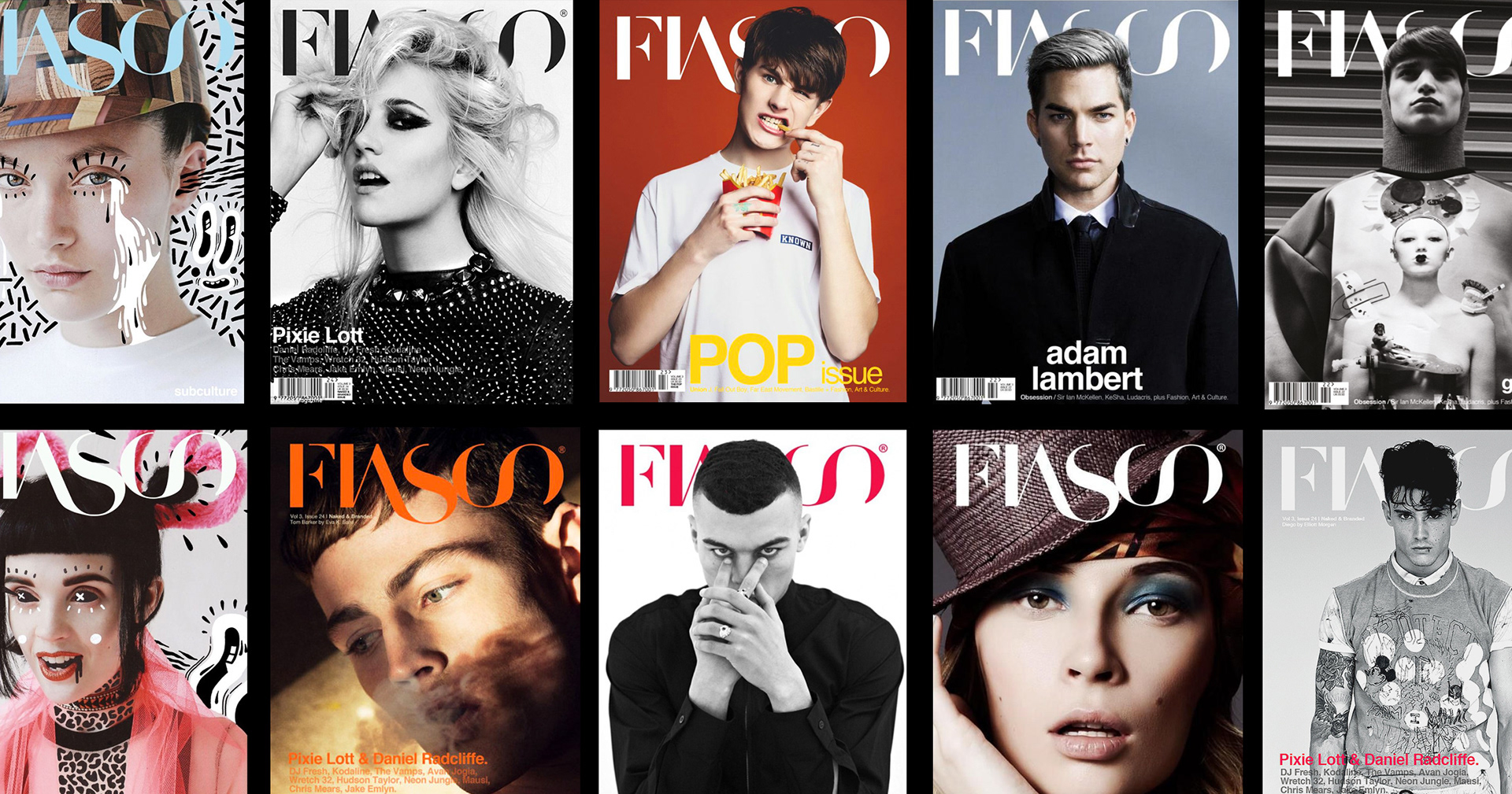
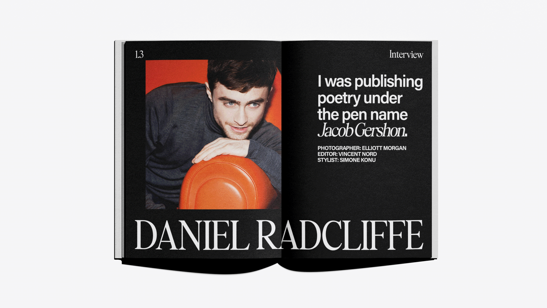
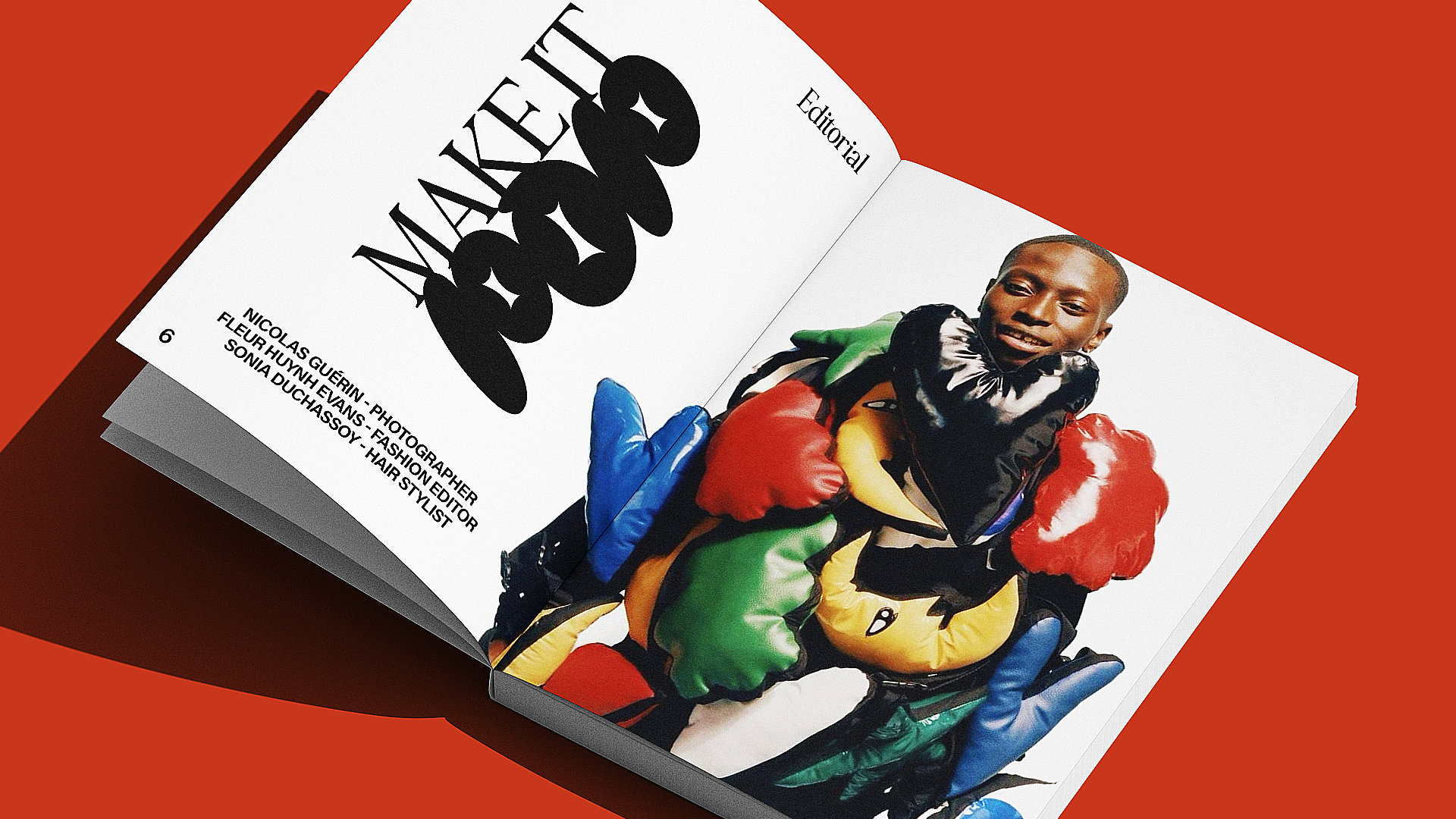
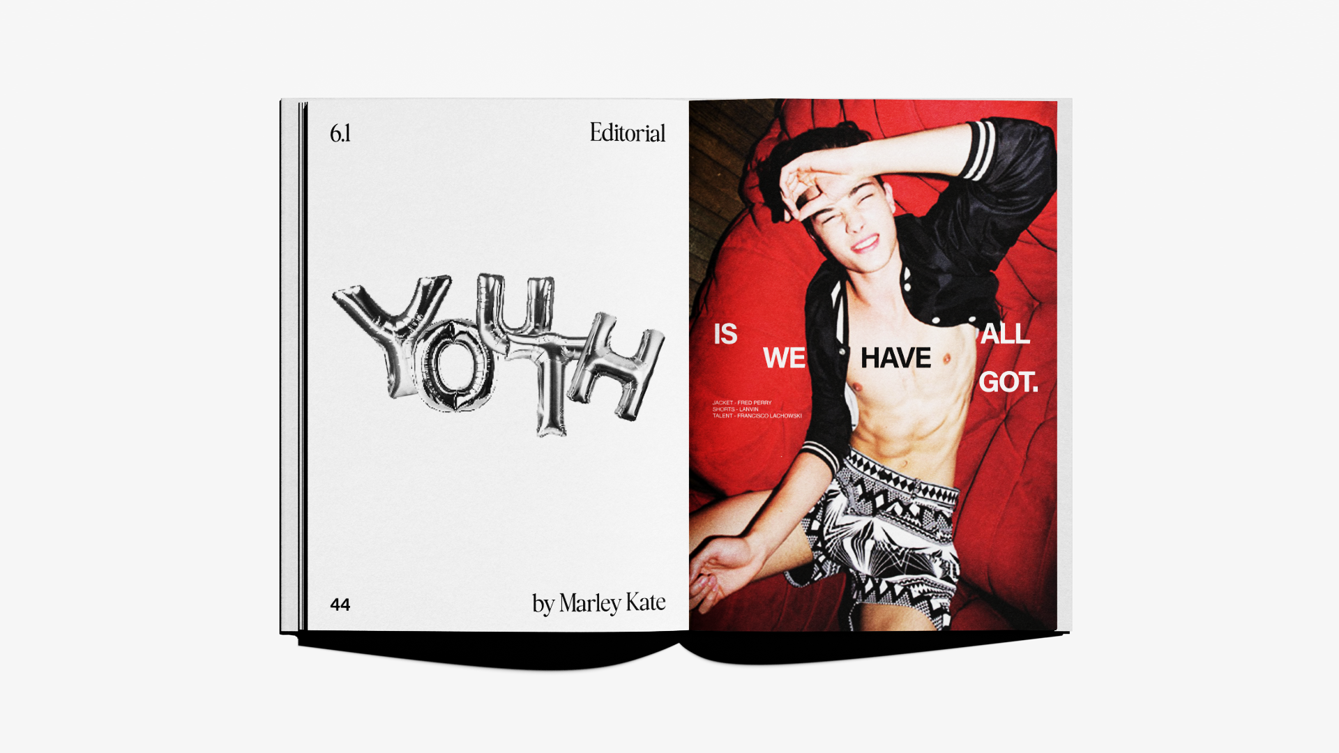
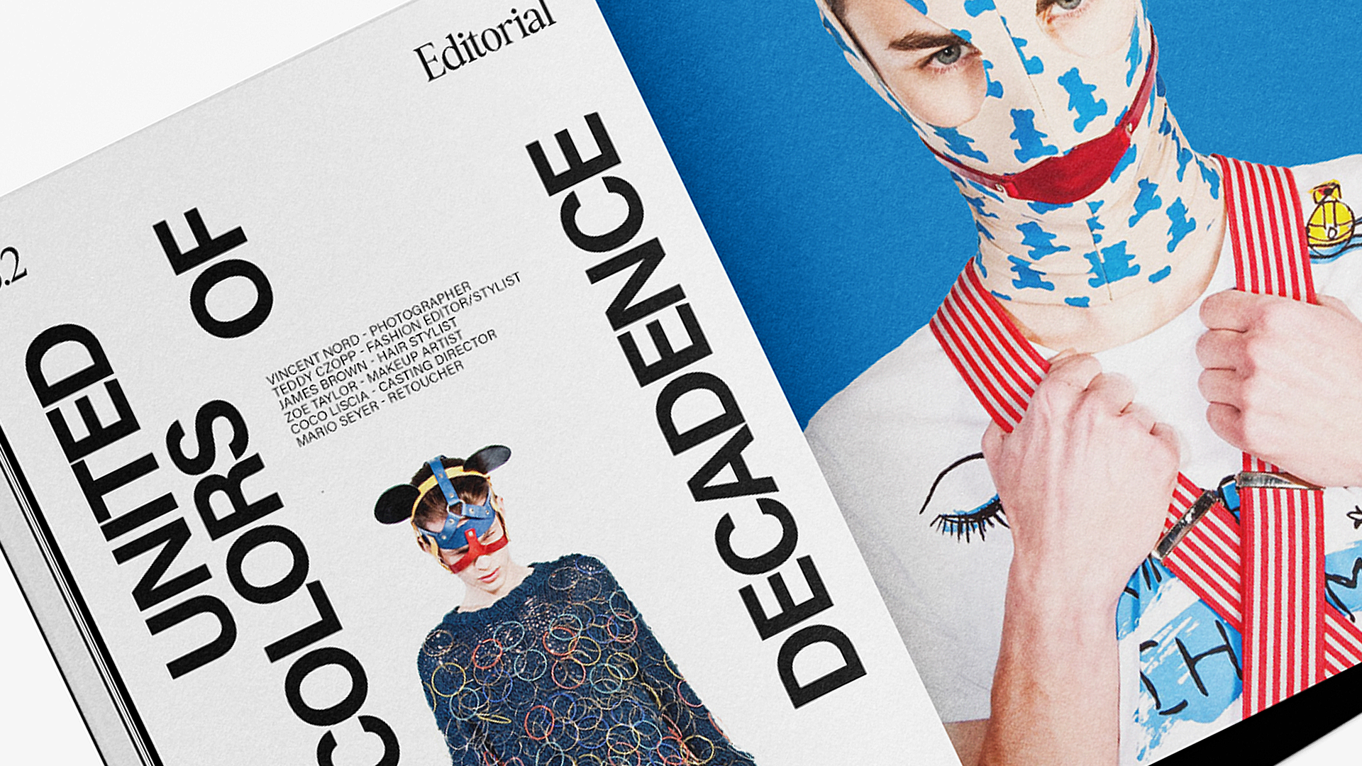
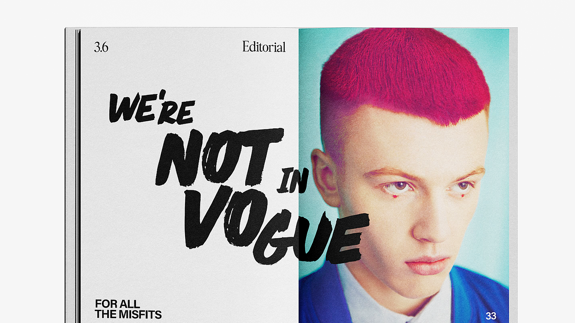
We redefine traditional typography with a modern and more contemporary twist. Finally, to support Fiasco's mission - to shine a spotlight on upcoming talent - we created three different content series centred on young creatives in fashion and culture.
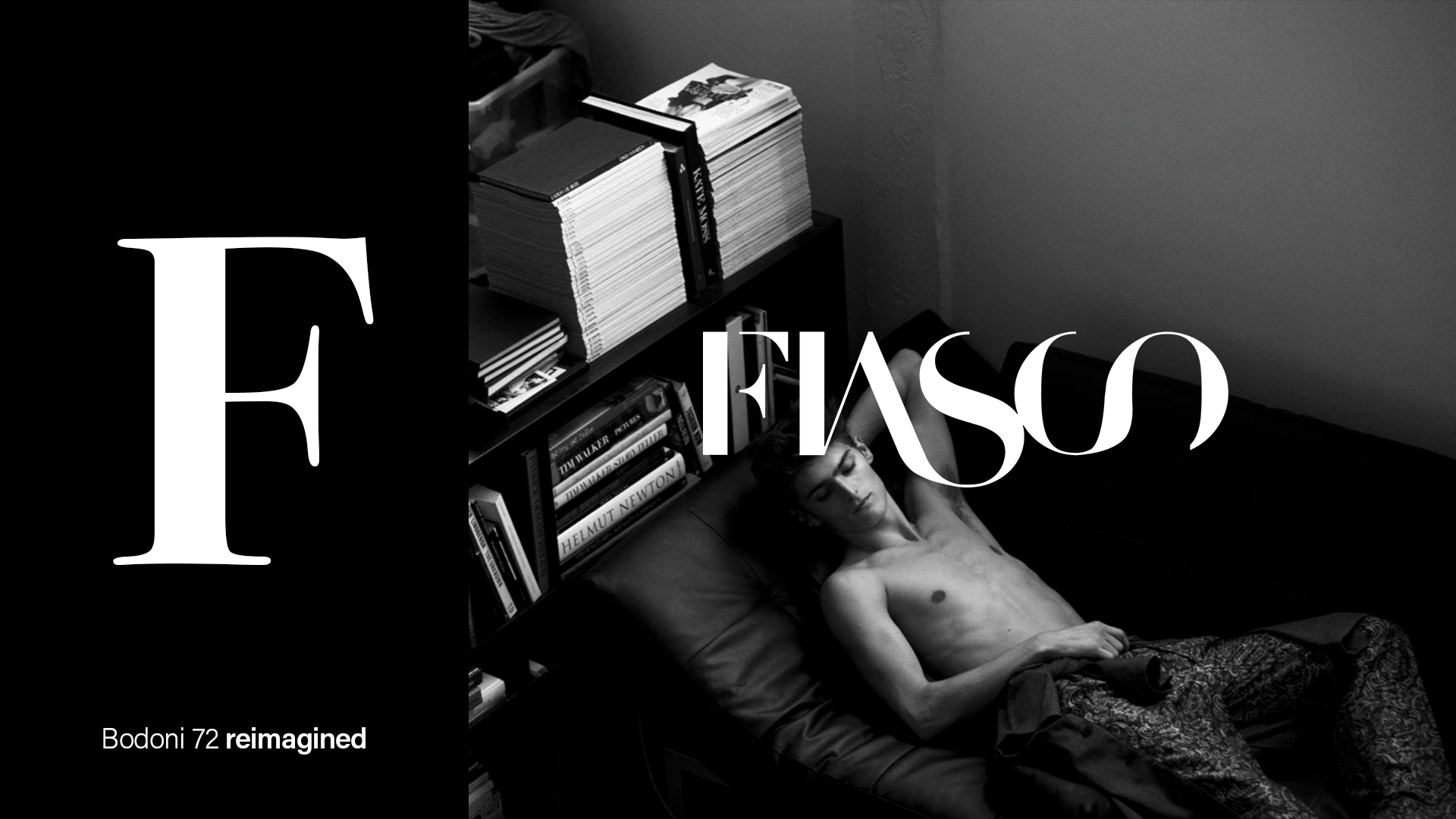
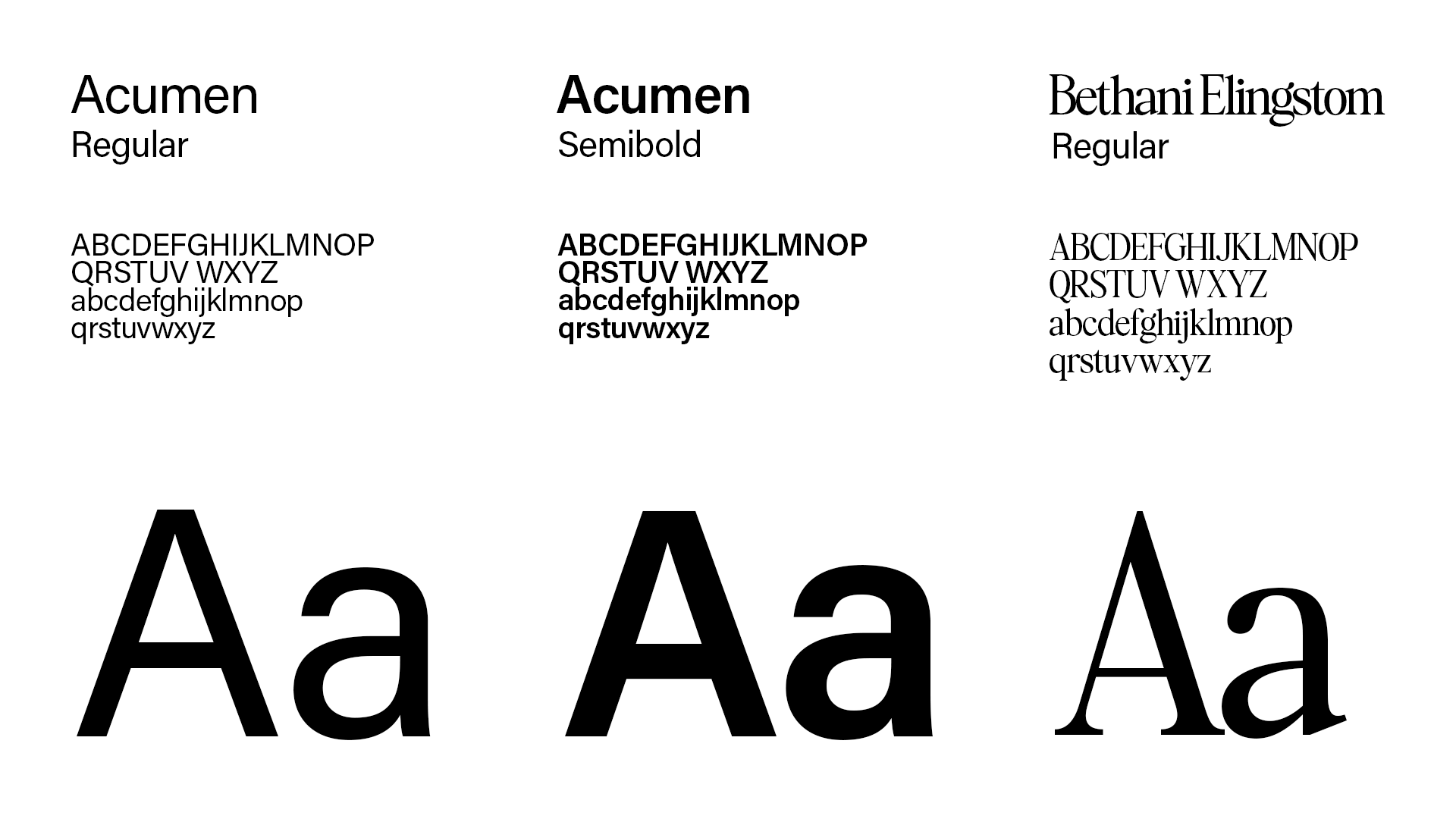
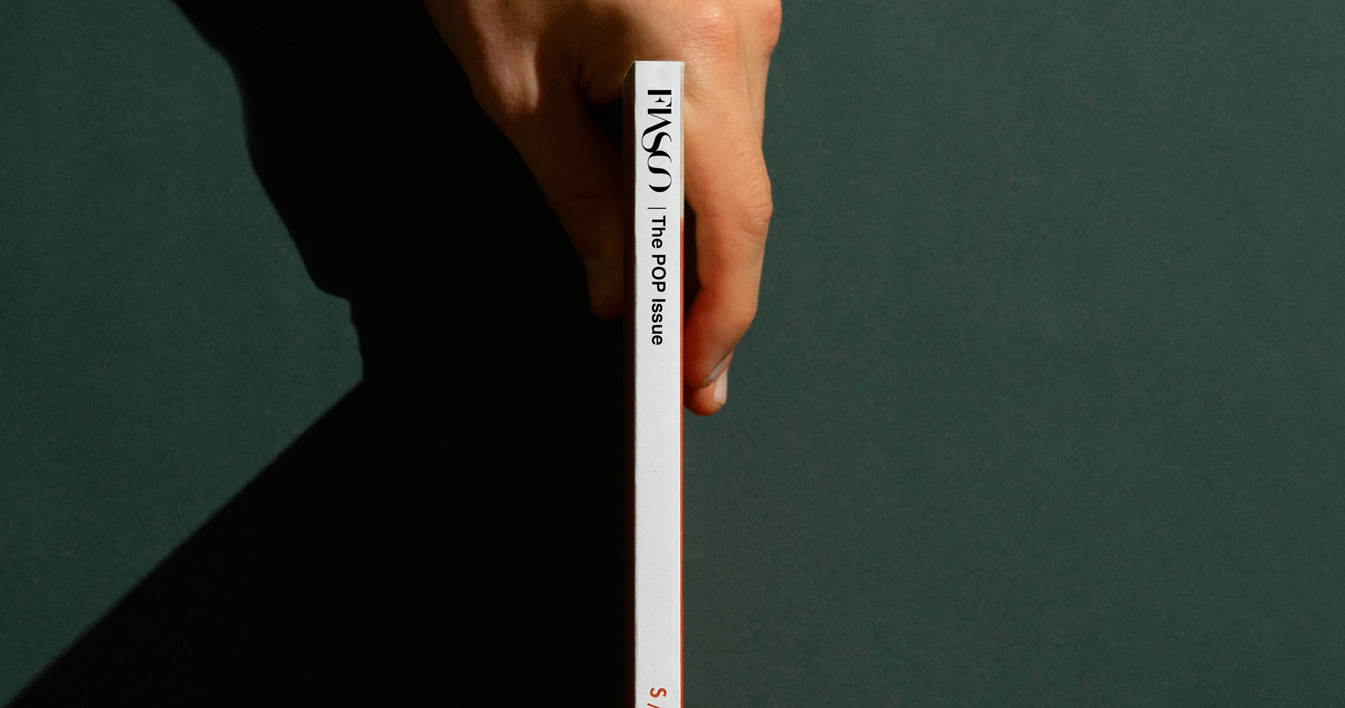
For the logotype, we chose to redefine the super-classic Bodoni 72 font, giving it a more contemporary twist. In the layouts of the internal pages, we paired two different sans-serif fonts to accentuate the contrast between the established, unwavering spirit of its publication and the more independent, underground feel of its content.
n
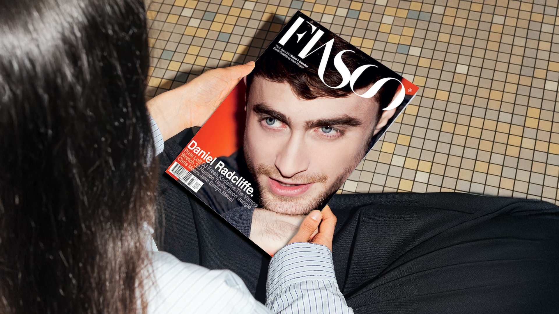
We ran an OOH campaign in London to promote the magazine launch in-store, where we truly embracing our manifesto. We picked three portraits of celebrities featured in megazine who couldn't make it through their career without facing a truly fiasco moment at the beginning.
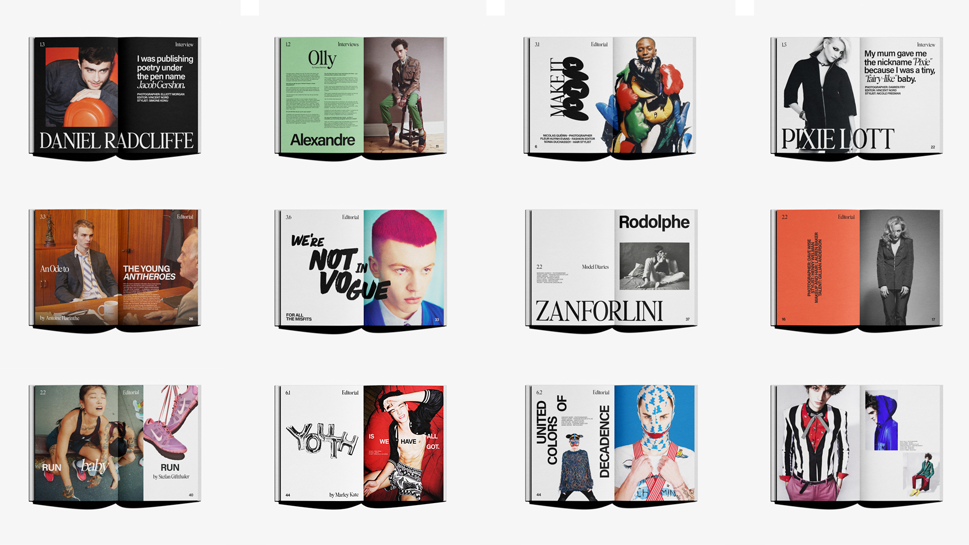
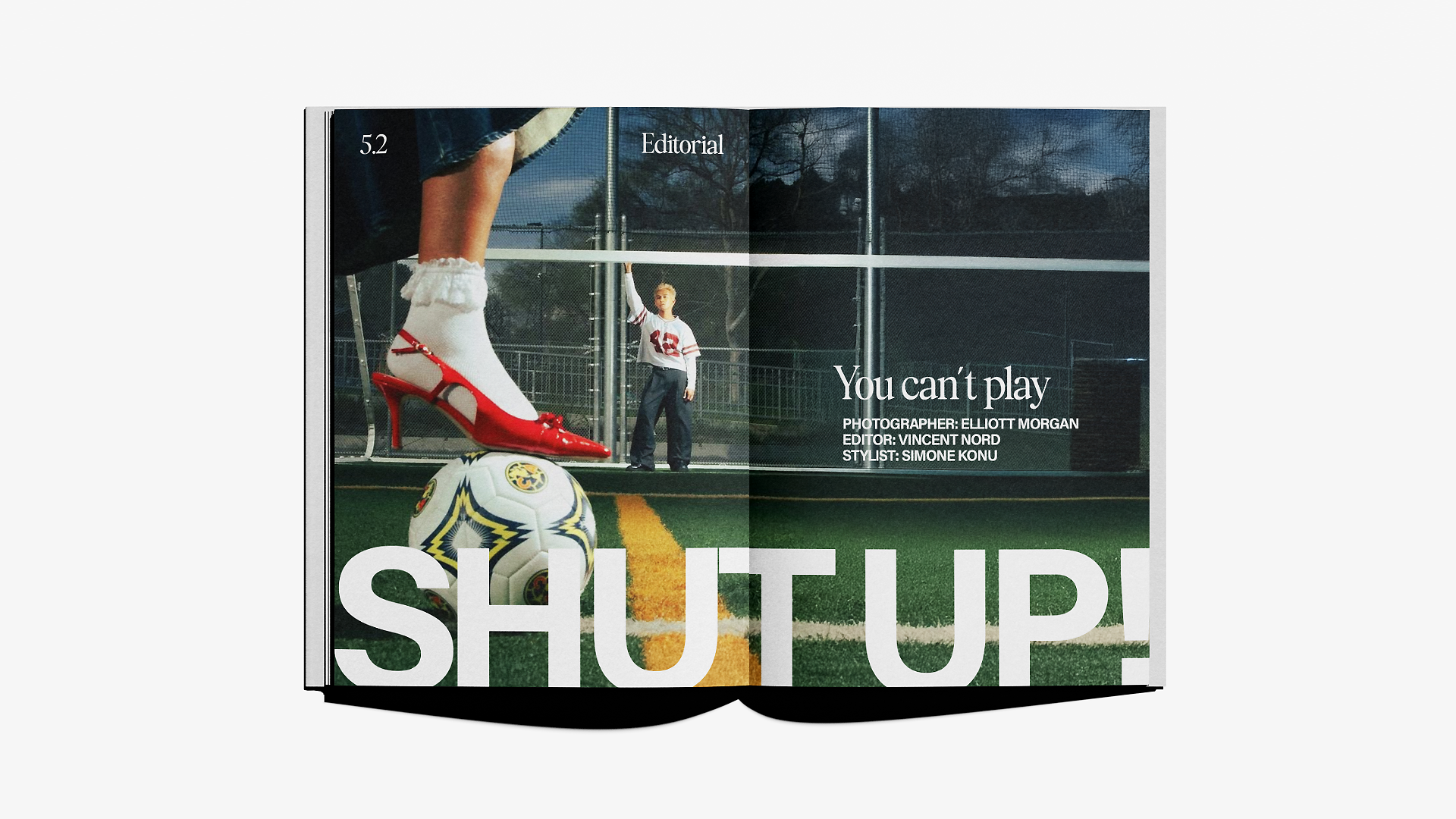
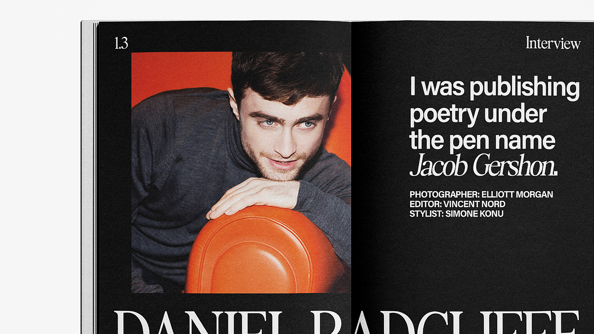
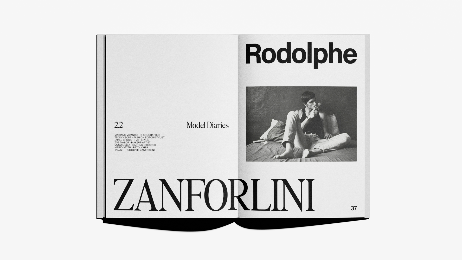
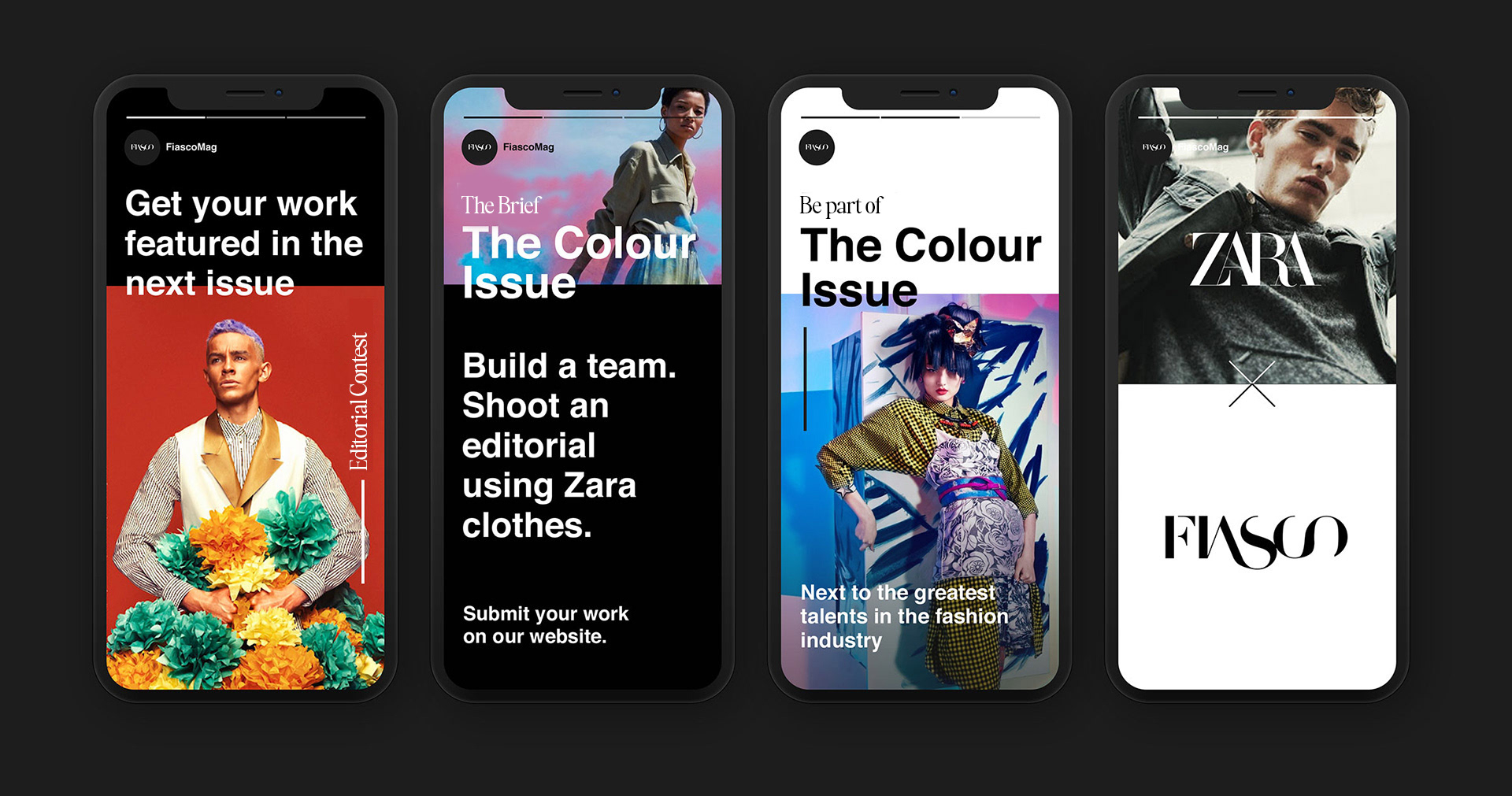
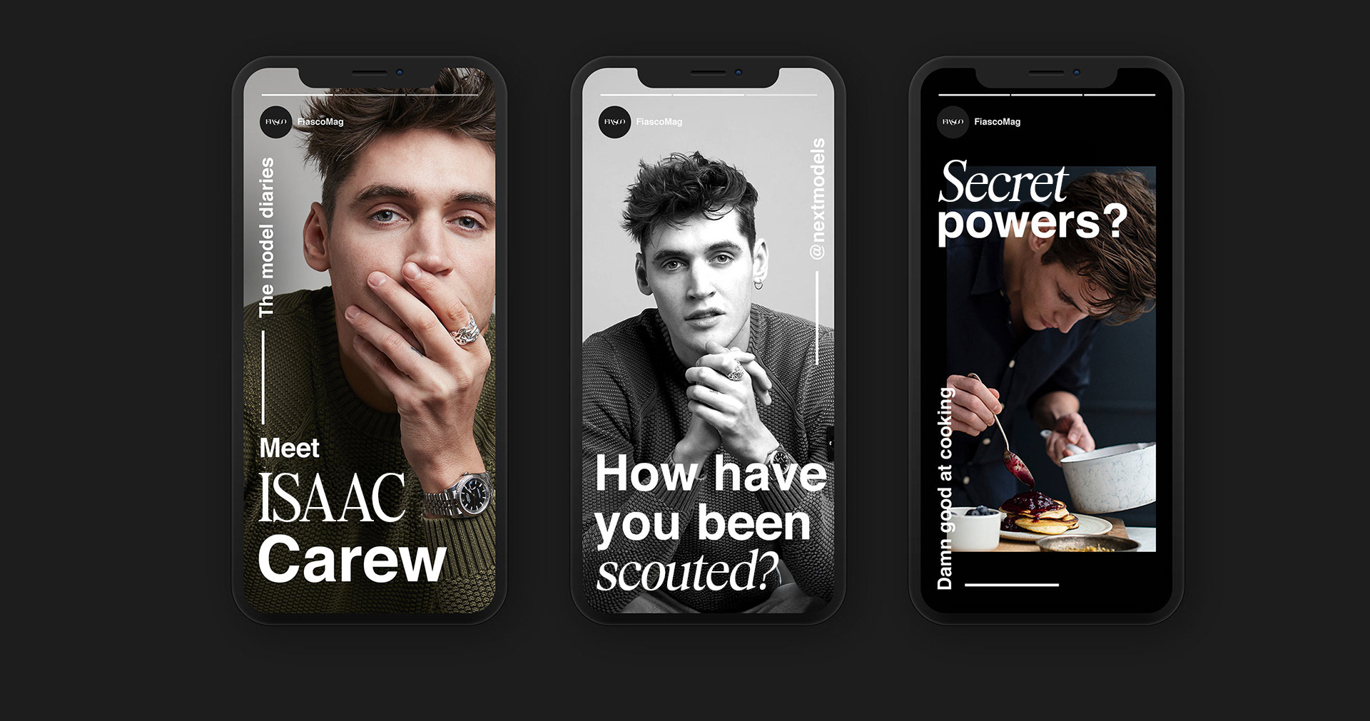
We created several content series - The Fiasco Contest, Next Generation Talent and The Model Diaries - to highlight and elevate young talent in the fashion industry.